Some good news for you map lovers out there: Today we’re launching the first public beta of Atlasify, a system that lets you make a map of, well, almost anything.
To understand how Atlasify works, let’s walk through a quick example. Say you’re interested in learning about World War II. You Google “World War II” and you get lots of interesting links, for instance to the “World War II” Wikipedia page. These days, search engines will also give you lots of structured facts about your query like the start date and end date of the war. Atlasify complements these links and structured facts with an entirely new way to explore information about your queries: automatically generated “heat maps”1.
So, for example, here’s what you get when you search for “World War II” in Atlasify:
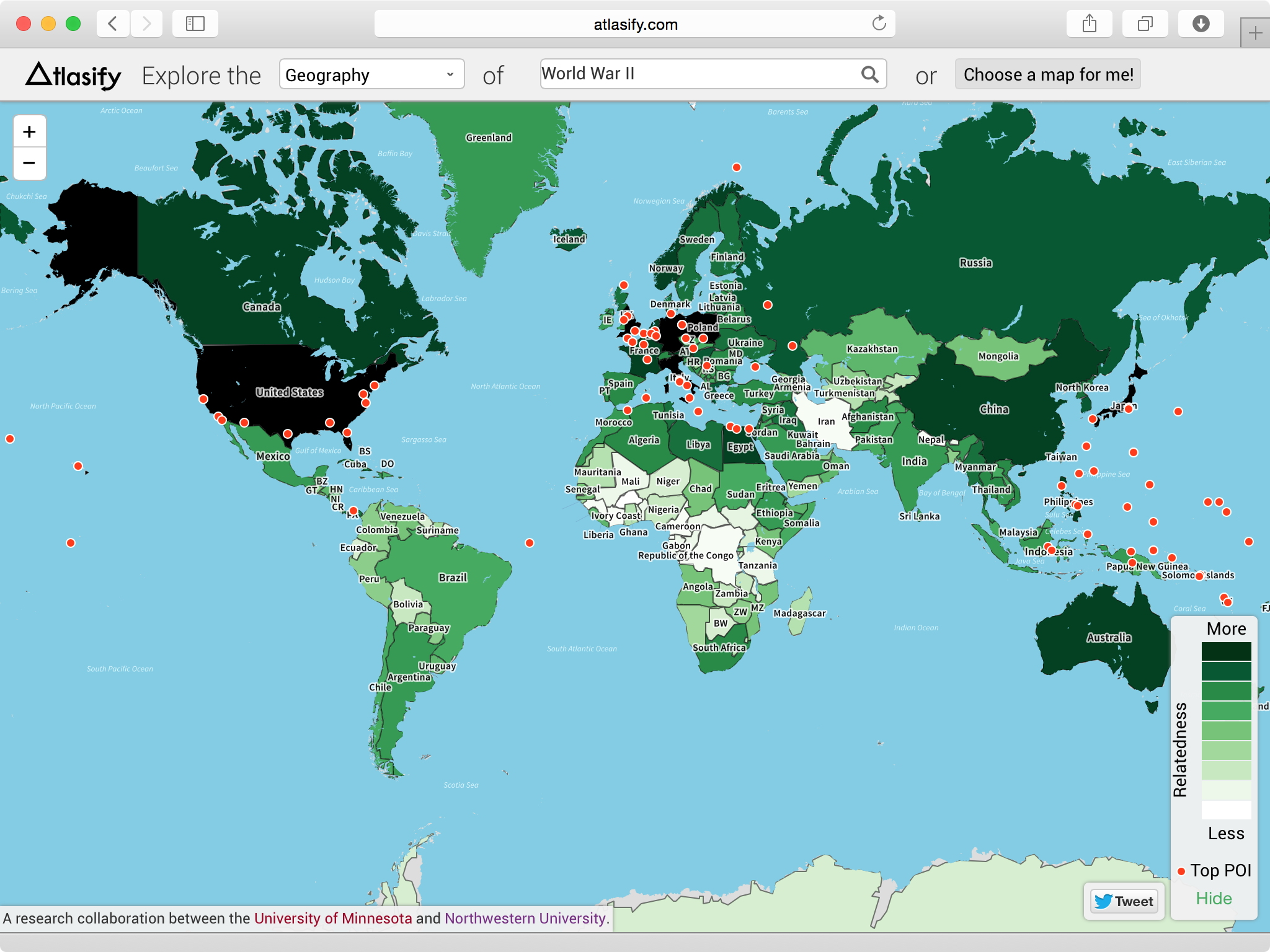
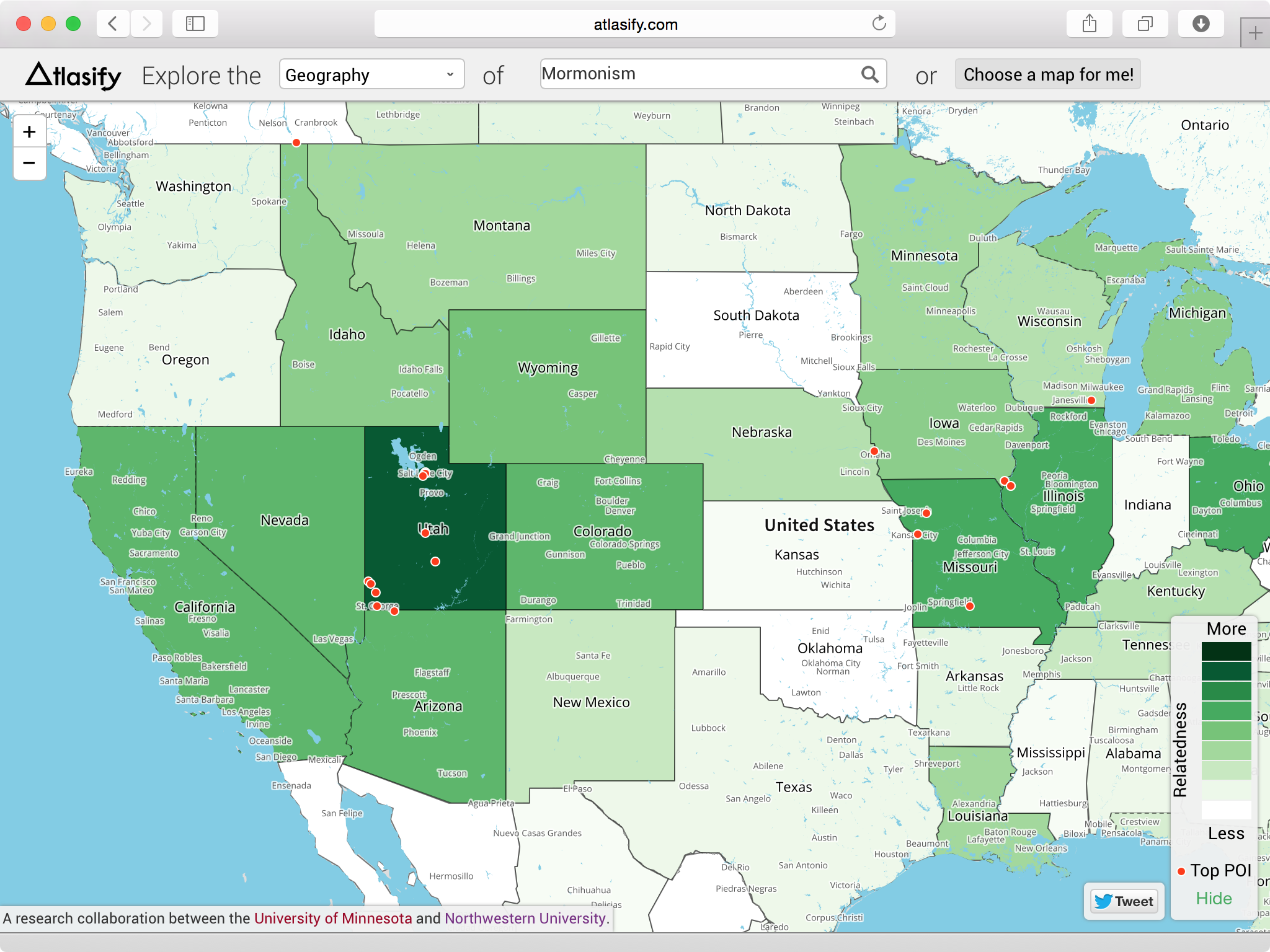
In this map, which Atlasify generates using text mining and spatial computing algorithms, the dark green areas indicate places very related to “World War II” and the light green areas indicate places that are less related. Red dots signify individual locations that are especially associated with the query.
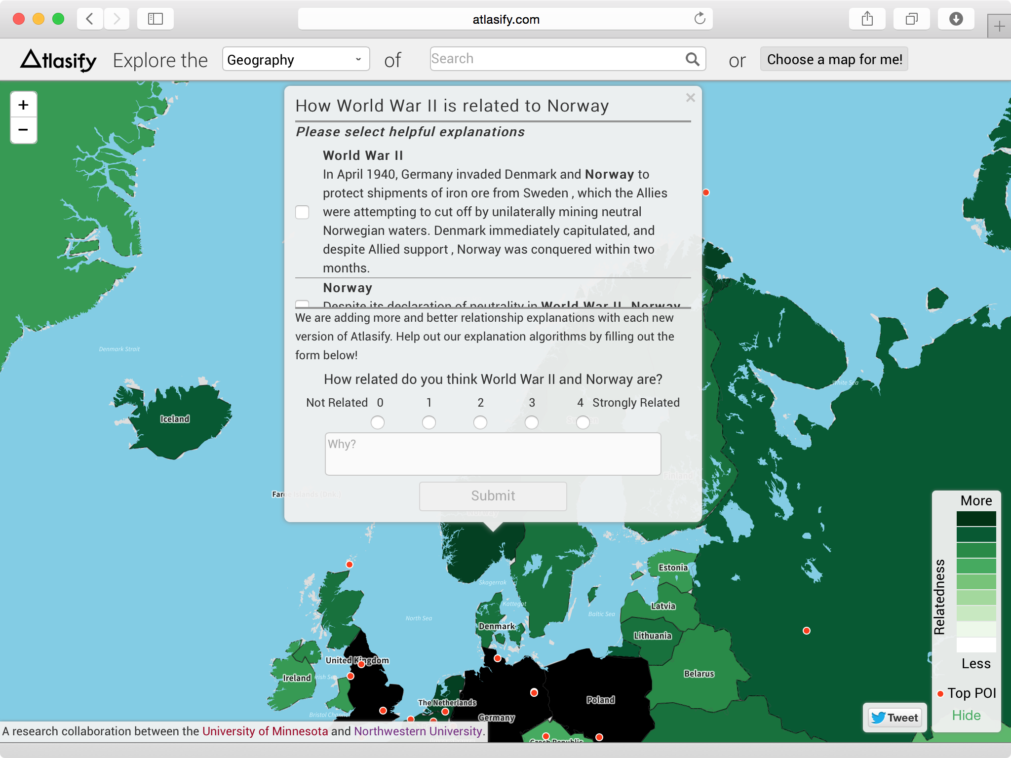
There’s more: If you click on a country (or state/province or dot), Atlasify will tell you how the place you clicked on is related to your query:
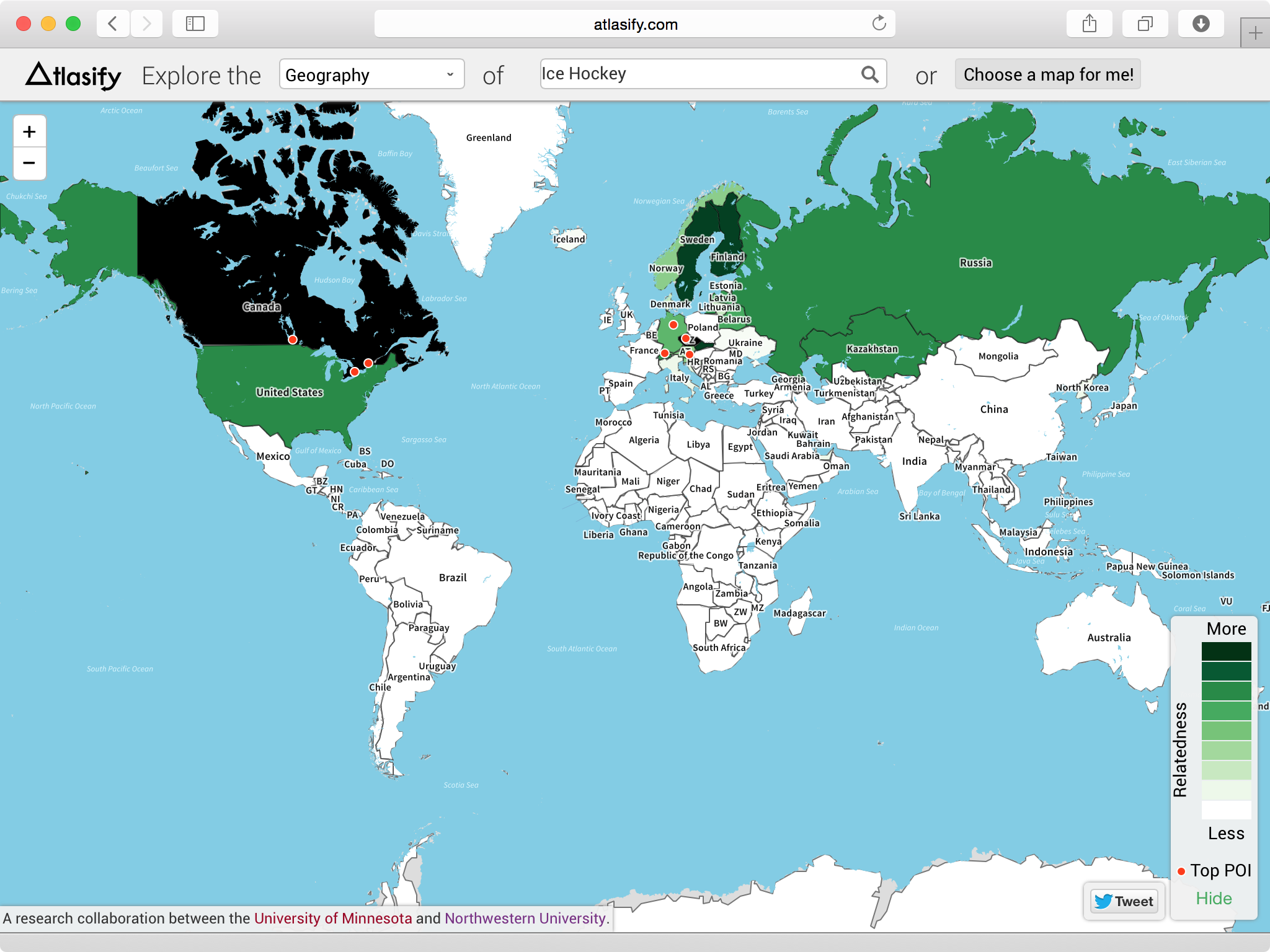
Atlasify can generate an interactive map like this for over 4.8 million different queries. Interested in learning about, say, ice hockey? Here’s a map for you:
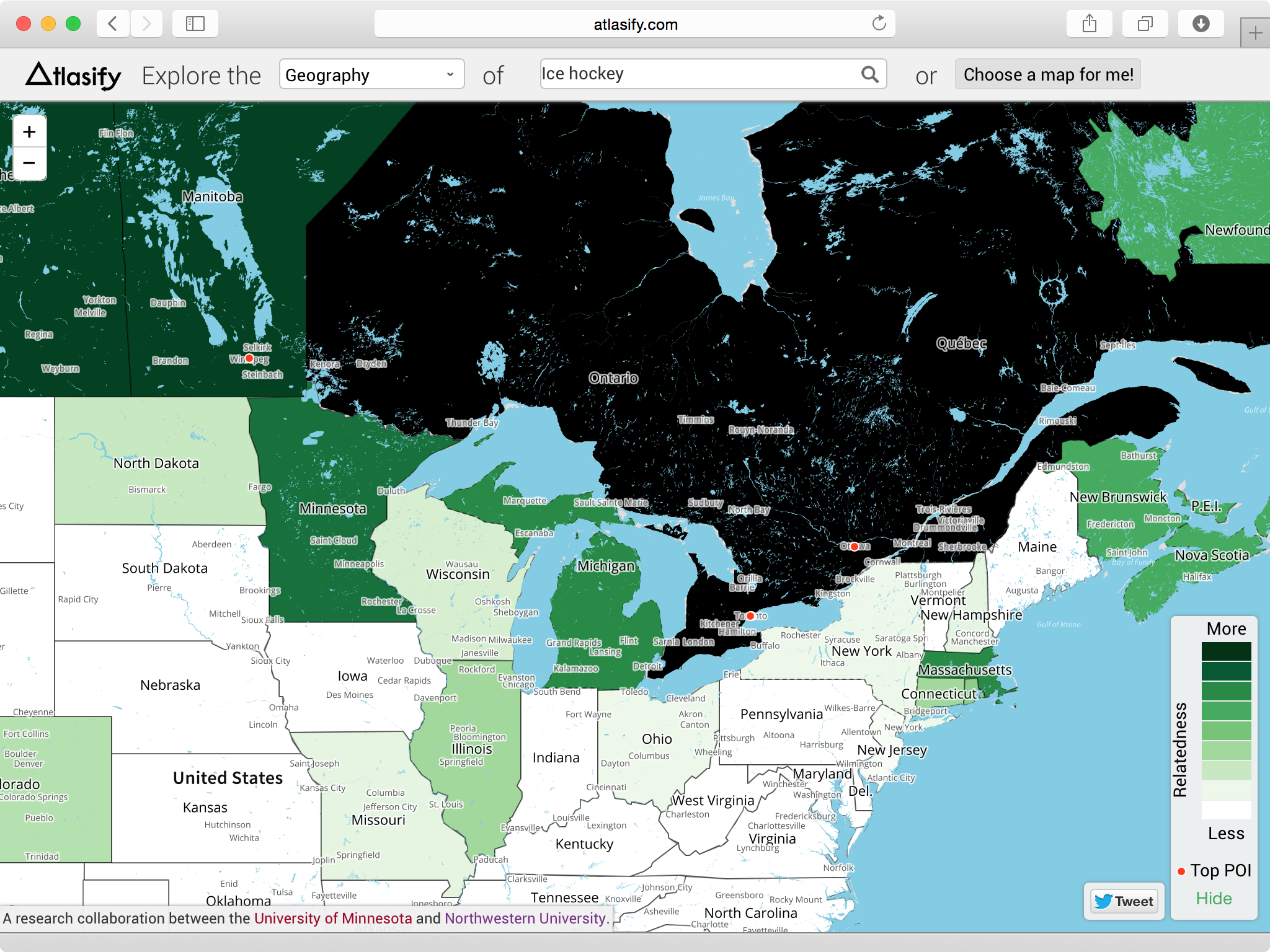
Zooming in a bit, we can see the states and provinces in the U.S. and Canada that are most related to ice hockey:
Perhaps you’d like to learn about, for example, Mormonism? Here’s that map:
Atlasify has one more trick up its sleeve: As it turns out, the exact same algorithms and technologies Atlasify used to create the maps above can also be used create this “map” of World War II on the periodic table:
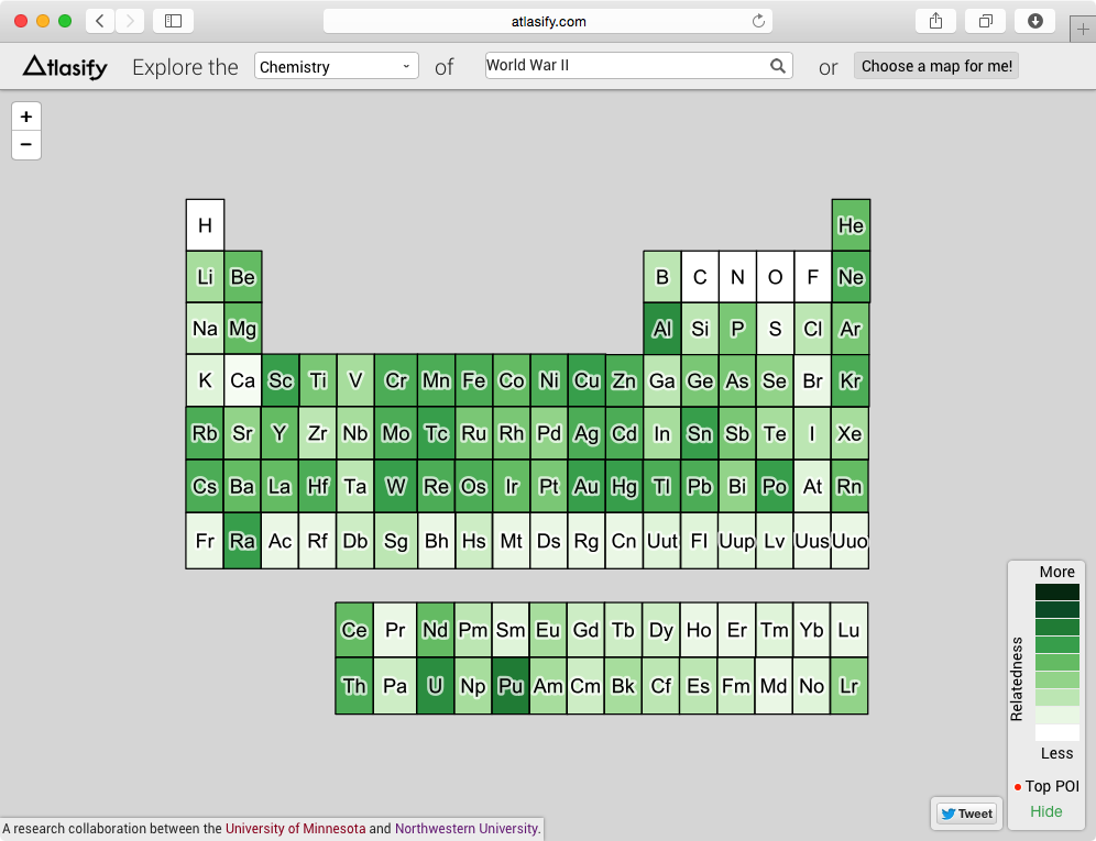
You can see that uranium and plutonium are correctly indicated to be quite related to World War II. Don’t know why they’re related? You can click on one of them – say, uranium – and read about the relationships between uranium and World War II.
Atlasify can do this for lots of different well-known “reference systems” in addition to the periodic table and the world map. The current version of Atlasify supports four reference systems. The other two – a timeline and U.S. senate seating chart – are currently in alpha.
To generate these maps and explanations, Atlasify uses a family of algorithms that we call “semantic relatedness plus explanation” measures (SR+E measures, for short) and a technique we call “explicit spatialization”, an homage to the explicit semantic analysis technique from Evgeniy Gabrilovich (now at Google) and colleagues. If you’re interested in learning more, we’ve published the full details in a paper at SIGIR2.
Atlasify is still in (early) beta, so please send us any ideas and feedback you have! Also, stay tuned: our algorithms (and the system as a whole) are improving on a weekly basis. You’ll notice that Atlasify frequently asks for your opinion of its results. The more you use this feature, the better Atlasify will get.
Now, quit reading and go play with Atlasify yourself!
Atlasify is a collaboration between GroupLens at the University of Minnesota and the WebSAIL group at Northwestern University. The Atlasify system was built by Toby Li (our ‘project manager’; GroupLens), Josh Ford (GroupLens), and Vijay Murganoor (WebSAIL), with development overseen by professors Brent Hecht (GroupLens) and Doug Downey (WebSAIL). A number of other folks have contributed to the Atlasify project, including Shilad Sen, Darren Gergle, Martin Raubal, and Johannes Schöning. For a full list of contributors, see the “About” page on Atlasify.com
1 Well, for our fellow cartography nerds out there, they’re technically choropleth maps.
2 Hecht, B., Carton, S., Quaderi, M., Schöning, J., Raubal, M., Gergle, D., Downey, D. 2012. Explanatory Semantic Relatedness and Explicit Spatialization for Exploratory Search. Proceedings of ACM SIGIR 2012. New York: ACM Press.
2 Responses to “Atlasify: Towards the “Geography of Everything””
-

-

Comments are closed.Samuel Ledermann
Nice job Brent. Can’t wait for the iPhone app for it. 🙂
A proud former classmate.
Joann Pastorius
Looks super fun to explore on a plethora of topics.