My first day as a PhD student in HCI is coming up pretty soon, so I’m being a good doobie and reading a bunch of papers in the field. A quick bit of background: I spent the first year of my CS PhD doing computational biology research in a microbiome informatics lab. I got tired of all the “Mo is a poop scientist” jokes (most of our data come from stool samples), so I decided to pursue a respectable career as an HCI researcher instead. TBH though, working with poop data was pretty cool, and I’ve had the wonderful opportunity of being exposed to papers in a field with entirely different standards and conventions, at least one of which could (and should) be adopted by papers in HCI.
I don’t always read papers super carefully. I also don’t finish every paper I start reading. Neither do you; be honest. I’m an exhausted grad student with limited time (and even more limited brain power). If your paper is easy to read, I’m a lot more likely to keep reading it. And if I finish reading it, I’m a lot more likely to share it. More shares = more people citing your work. So really, one of your goals when writing a paper should be to keep me off Reddit for long enough to fully engage with the wonderful new research you worked so hard to produce. But how could you possibly compete with this adorable baby skunk I found on r/aww? I mean look at it.

As they say, “if you can’t beat ‘em, join ‘em.” Take a page out of Reddit’s book: more pictures! To see why, here’s a quick analysis I had fun running last weekend on a web scrape of CHI 2019 papers (@sig_chi, please unblock my IP address). TL;DR: CHI 2019 papers with more figures tend to be downloaded more.
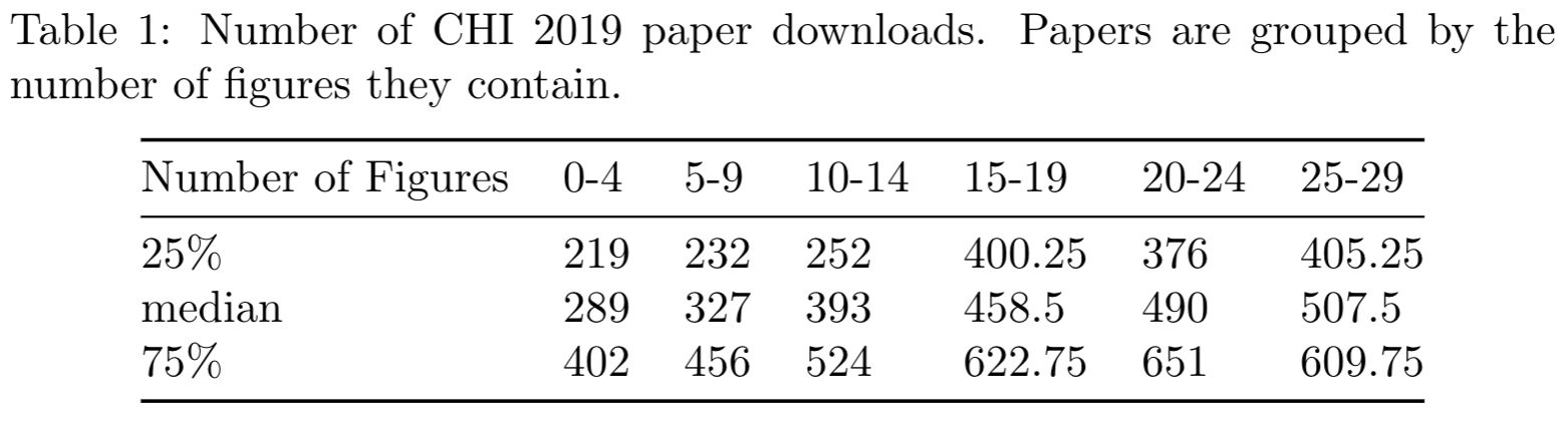
Did you actually bother reading the table, or was it TL? Okay, now here’s the same data presented in a box plot instead:
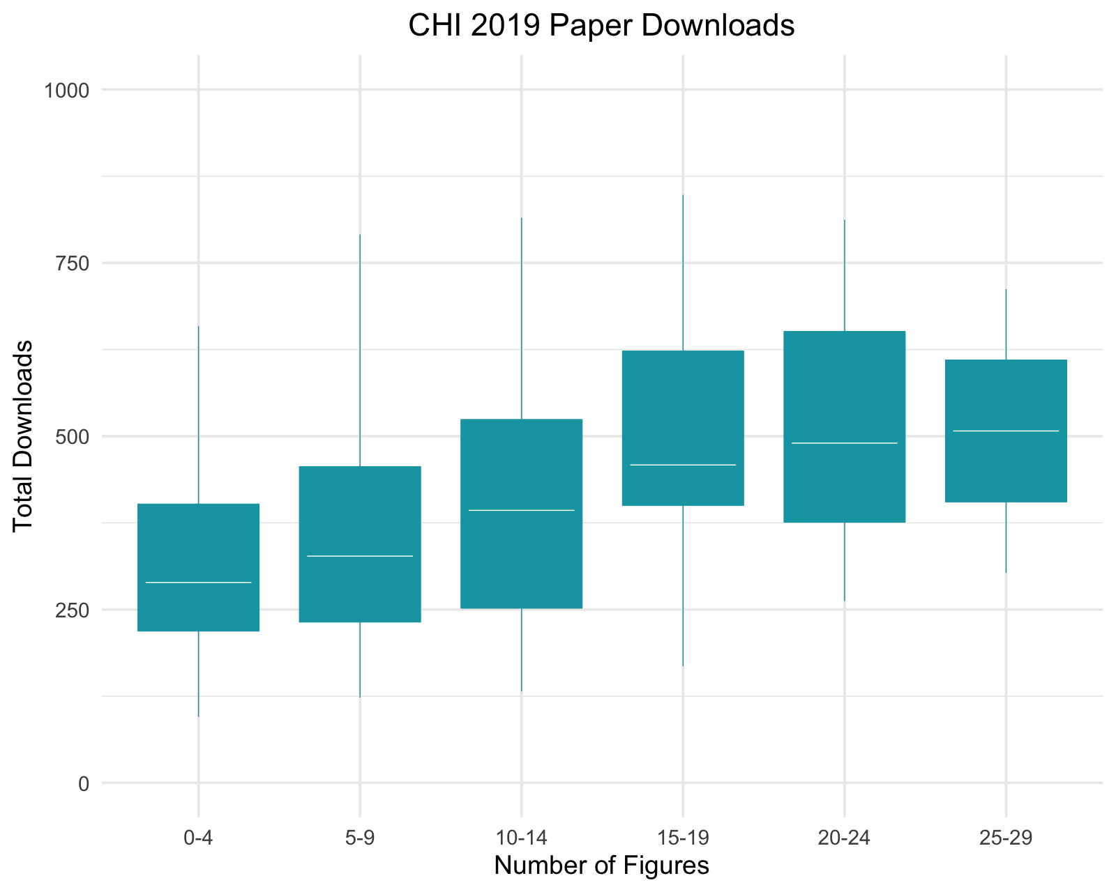
Oooooh, pretty!
When I presented my data in a table, I forced you to do some extra work to identify the important trend for yourself (if you even bothered looking at the table, that is). I made you perform tedious column-by-column comparisons of numbers. With your actual eyeballs. The horror!
But it doesn’t have to be this way. Using a figure instead—in this case a box plot—communicates the same essential piece of information in a fraction of the time, for a fraction of the effort on your part. A quick visual scan is all it takes for you to get the all-important message: more figures leads to more downloads. Got it.
From what I’ve noticed so far, HCI papers use figures a lot less effectively than papers in computational biology. But citations/downloads aside, we want our research to be as clear and accessible as possible, especially when trying to communicate our work to a broader audience, or to relevant stakeholders in the general public. Our field is human-centered, after all.
More great tips on disseminating your research in this CHI 2020 paper by my colleagues, BTW. See you next time.